

Use Case Part III: Balsamiq
After sorting through two other challenges with moving to their current static docs site generator, Leon Barnard at Balsamiq tackles ongoing maintenance of list pages where the lists should be appealing to click and use.
Check out the prior two parts of this series, including how to use conditional text with Markdown to document multiple product releases, and simplify source files while providing animated gif files that include a play and pause action.
Challenge #3: Giving the list pages a makeover
The last challenge is one that I had wanted to do for the first release of our new docs site but never got around to. The challenge is that it’s hard to make a documentation site look pretty beyond the home page, whether it’s a static site or not.
Let’s look at the Dropbox help site home page as an example:

I love the illustrations and layout. Very appealing and inviting. But as soon as you go a level deeper you get this:

A big ol’ list of links. A wall of text. It’s a very different feel from the page you came from.
It’s clear to me that this page is automatically generated by some kind of content management system (CMS) template. Designers for pages like this usually cede control of the placement of the articles to the CMS, because they don’t want to have to manually update it every time a new article is added.
They’re limited because they don’t know how many articles there will be in each category, so most sites just end up creating a simple list, perhaps in sub-categories. Even awesome documentation sites like Mailchimp and Zapier do this once you go beyond the first level.
And this is exactly what we do on our documentation site within each product category currently:
But I really love the look of hard-coded landing pages like the Dropbox site. The illustrations, the grid layout, and the way it directs you to the most important information. I wanted to see if we could make our second-level pages look more like that.
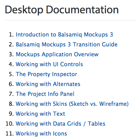
To cut to the chase, here’s what the upcoming version of our docs site will look like:
It feels more like a documentation site landing page, right? It has a featured articles section with the articles that are most relevant to new users, and the rest of the articles are split evenly into three columns. Yet none of it is hard-coded, even the featured “Getting Started” articles.
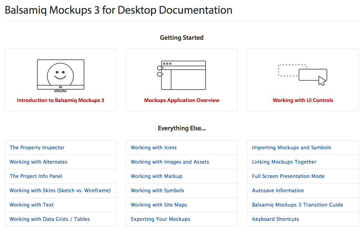
I’ll start by explaining the “Everything Else…” section at the bottom and what makes it different from our previous version.
The links there are automatically placed by Hugo and styled using the Bootstrap List group component. That part is pretty easy. The challenge was putting them in columns and making sure that the columns were of equal heights, regardless of how many articles there were.
Here’s the code I wrote inside the Hugo template to define some variables to use further down in the code:
{{ $featuredRows := 1 }} // number of rows to feature in Getting Started section
{{ $totalCount := len (where .Site.Pages "Section" "desktop") }} // total number of articles in this section
{{ $rowCount := (sub (div (add (add $totalCount 1) (mod $totalCount 3)) 3) $featuredRows) }} // number of rows in each column
And when it comes time to populate the columns:
<div class="row mt1">
  <div class="col-xs-12 col-md-4">
    <div class="list-group">
      {{ range first $rowCount (after 3 .Data.Pages.ByWeight) }}
      <a href="{{ .Permalink }}" class="list-group-item">{{ .Title }}</a>
      {{ end }}
    </div>
  </div>
  <div class="col-xs-12 col-md-4">
    <div class="list-group">
      {{ range first $rowCount (after (add $rowCount 3) .Data.Pages.ByWeight) }}
      <a href="{{ .Permalink }}" class="list-group-item">{{ .Title }}</a>
      {{ end }}
    </div>
  </div>
  <div class="col-xs-12 col-md-4">
    <div class="list-group">
      {{ range first $rowCount (after (add (mul $rowCount 2) 3) .Data.Pages.ByWeight) }}
      <a href="{{ .Permalink }}" class="list-group-item">{{ .Title }}</a>
      {{ end }}
    </div>
  </div>
</div>
The variable called $featuredRows helps determine where the count should start for columns. From there Hugo counts the number of remaining articles and divides that number by 3 (rounded up to the nearest whole number). It then creates the number of items in each column so that they are as even as possible. It takes a bit of math to do it, but that’s what computers are good at anyway.
And now to that “Getting Started” section at the top…
I wanted different images for each of the featured articles, but I just didn’t like the idea of hard-coding any links or resources, in case we decided to change things later (and also because I’m stubborn). So, the top part of the code identifies the first three articles (ordered by weight), lists their names, links them up, and then grabs an image for each of them using the following code:
<img src="https://media.balsamiq.com/img/support/docs/m4d/b3/toc-button-{{ .File.BaseFileName }}.svg">
The trick is that the last part of the image file name is the same as the name of the markdown file. So, the article called intro.md uses an image called toc-button-intro.svg. This means that if we want other articles to show up in the “Getting Started” section we don’t need to touch this page. We just adjust the weights in the front matter and add a new image that corresponds to the file that will get moved into that area.
Voila!
The moral of the story
So, what did we learn from these challenges? I think the most important thing is that all of them were overcome without making life harder for the content writers. We didn’t compromise on keeping the workflow simple when we added functionality, even though we were tempted to.
We could have switched away from Markdown. We could have started writing HTML inside our Markdown files. We could have required manual template updates when we reordered articles. It took a lot of work not to do these things. But that’s the beauty of programming: it’s an up-front investment that saves time and effort in the long run.
Static sites may seem to have more limitations than traditional CMSs or powerful technical writing tools. But if you can find a way around the limitations, you can reap the benefits that made static sites attractive in the first place. Markdown is easy. GitHub offers collaborative coding. A scripted robot can run a build command from a terminal. It’s writing excellent documentation that is tough. Fortunately, that’s what technical writers are good at. Having a developer liaison for the docs team can free writers from having to think about the limitations of the technology they’re using so they can focus on writing the docs.